

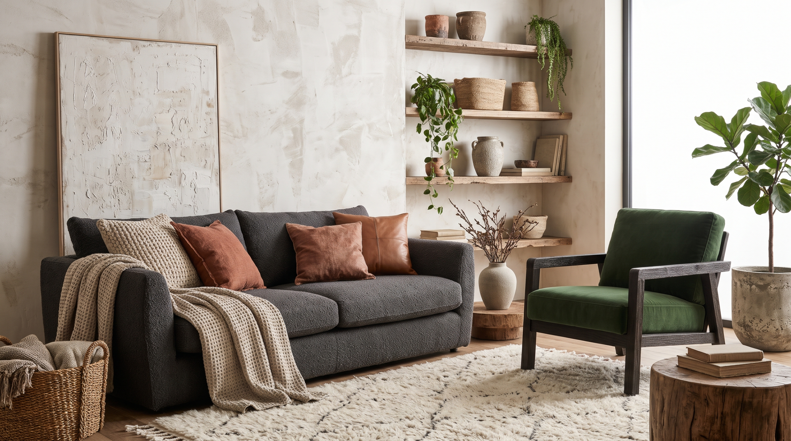
You have chosen the paint colour, found the right sofa and hung the curtains, yet the room still feels flat. Nothing is wrong exactly, but nothing holds the eye either. In most cases, the missing ingredient is not another piece of furniture or a bolder colour. It is texture.
Texture is how a surface looks and feels, and every material has some. Timber has grain, stone has veining, linen has a slub, and even a wall can carry subtle movement. Chosen with care, these surfaces add depth and warmth without adding clutter.
Why Texture Matters
Colour tells you what a room looks like. Texture tells you what it feels like. Tactile texture is what you can physically feel, such as a wool throw or rough brick. Visual texture is what the eye reads on a surface that may be smooth to the touch, such as the veining in marble or the sheen of velvet. A balanced room uses both.
This matters most in neutral schemes, where soft whites and stone tones rely on texture to avoid feeling bland. If you lean towards minimalist living, texture is what keeps a pared-back space calm rather than cold.
Start With a Base Texture
Look first at the largest surfaces: the floor, the walls and the biggest piece of furniture. One of these should set the tone, whether that is a wide-plank timber floor, a linen sofa or a textured wall. Everything else can then complement or contrast with it.
Bring in Timber and Stone
Wood brings natural grain and warmth. A solid oak table, a limed floor or a reclaimed beam adds a sense of age that manufactured surfaces struggle to match. Mix finishes rather than matching them, and look for pieces with patina, such as a worn leather armchair or an old chest with softened edges.
Stone adds weight and coolness to balance softer elements. A marble side table or limestone fireplace surround can anchor a corner without dominating it, and honed finishes feel more relaxed than highly polished ones. In older houses, original stone and brickwork are worth keeping, as our guide to renovating a period property explains.
Layer Fabrics and Smooth Surfaces
Fabrics are the quickest way to adjust texture. Wool throws, washed linen curtains, velvet cushions, bouclé upholstery and a jute rug all read differently.
Smooth surfaces matter too. Glass, brass and glazed ceramics give tactile pieces something to play against, which is why a glass vase on a rustic wooden table works so well. Group a few objects of different heights and materials, and leave space around them.
How Common Materials Compare
| Material | Texture Type | Feel It Brings | Works Well In |
|---|---|---|---|
| Timber | Tactile and visual | Warm, natural | Floors, dining tables, bedrooms |
| Stone (marble, limestone, travertine) | Tactile and visual | Grounded, cool | Fireplaces, kitchens, side tables |
| Linen | Tactile | Relaxed, airy | Curtains, bedding, sofas |
| Wool and bouclé | Tactile | Cosy, soft | Throws, rugs, armchairs |
| Velvet | Visual (sheen) | Rich, refined | Cushions, headboards, occasional chairs |
| Jute and rattan | Tactile | Casual, earthy | Rugs, baskets, pendant lights |
| Glass and glazed ceramics | Visual | Light, crisp | Vases, lamps, shelf displays |
| Brass and metal | Visual | Polished, warm-toned | Lighting, handles, frames |
| Textured wall finishes | Tactile and visual | Soft movement, depth | Feature walls, hallways, living rooms |
Treat Walls as a Surface, Not a Backdrop
Walls cover more area than anything else in a room, so their finish shapes its character. Panelling, cornicing and panelled doors all add relief and shadow, particularly in period homes.
Decorative finishes go further. Homebuilding & Renovating describes limewash as a breathable finish with a deliberately uneven, tonal look. Because it reacts strongly to light, one Ideal Home writer found it worth testing a patch and watching it through the day. Polished plaster suits living rooms and hallways where a more refined finish fits, and the kind applied by specialists such as Evoke Polished Plastering typically shows gentle shifts in tone rather than one flat colour. One textured wall or room is often enough, so keep the surfaces around it simpler.
Let Lighting Do the Work
Texture only shows when light hits it. Smooth surfaces bounce light around, while textured ones scatter it and create soft shadows. A single overhead pendant flattens everything, but lamps and wall lights at lower levels pick out grain, weave and surface variation.
How Texture Works in Different Rooms
Living Rooms
A linen sofa, an oak coffee table and a stone lamp give three distinct textures at a glance.
Bedrooms
Keep textures soft and low in contrast. Layered linen bedding, a wool blanket and an upholstered headboard feel restful without adding pattern.
Open-Plan Spaces
Use texture to define zones. A rug marks the sitting area, a stone worktop the kitchen. Repeating one material throughout keeps the space connected, and carrying it outside helps a room flow into the garden, as with French courtyard gardens.
Find Your Texture Palette
Choose a room and the feel you want, and we will suggest a base texture plus three to layer around it.
1. Choose a roomHow to Avoid a Busy Room
- Keep the colour palette tight so textures do the talking.
- Choose one statement surface per room.
- Balance rough with smooth so the eye has somewhere to rest.
- Use bold textures for focal points and finer ones in smaller rooms.
- Leave empty space so each texture can be noticed.
From Flat to Finished
If a room feels flat despite the right furniture and colours, look at its surfaces before buying anything new. A change of fabric, a timber piece with real grain or a textured wall can give a space the depth it was missing. Build slowly, keep the palette calm and let light play its part.

